

BTC/Crypto Outlook (Charts)
Did Trump steal our lunch money?

All charts are available dynamically within ai.catenacap.xyz where there is a dynamic AI service for Macro & Micro viewpoints into the markets.

BTC via EUPHORIAMETER → not yet in the topping zone, but have entered it…

Firmly in Risk-Off (green is Risk on)

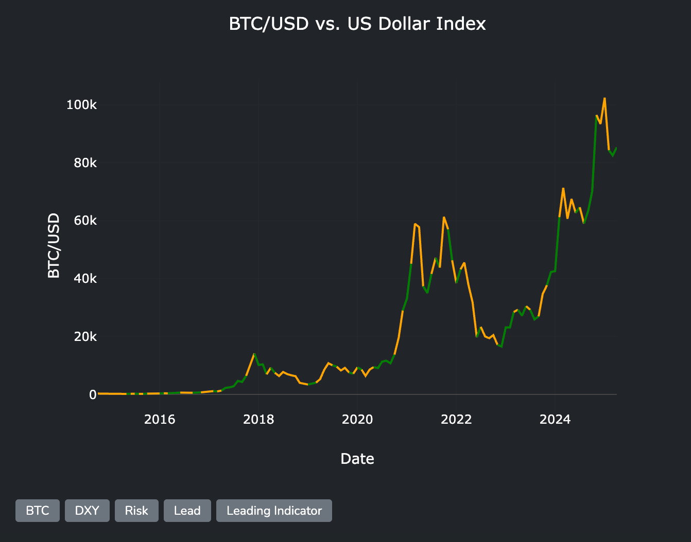
ASIAN EURO v DXY → looking like a bottom for BTC when aligning periods of peaks/troughs historically
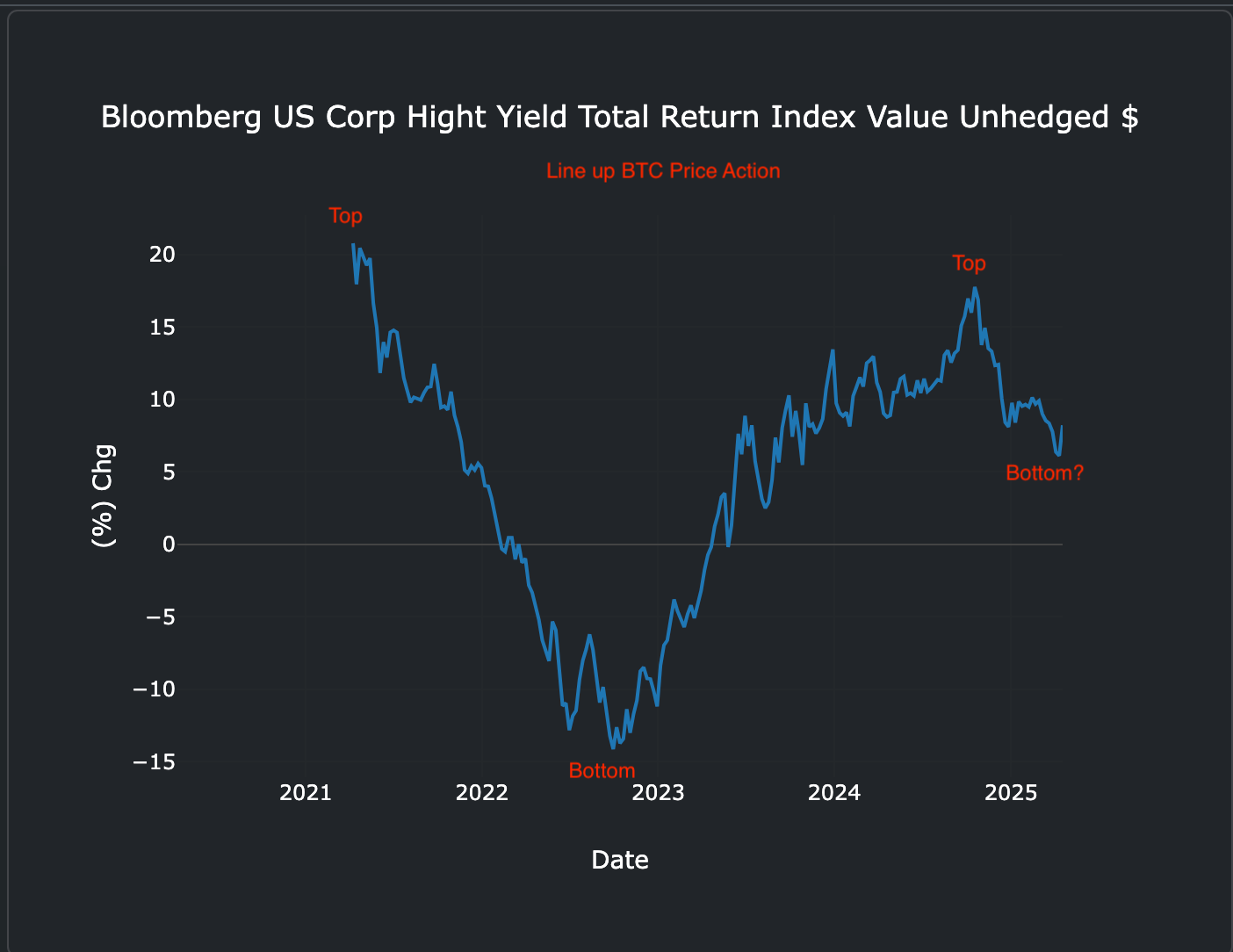
When running against Bloomberg High (Hight?) Yield Total Return Index, lower time-frame analysis.

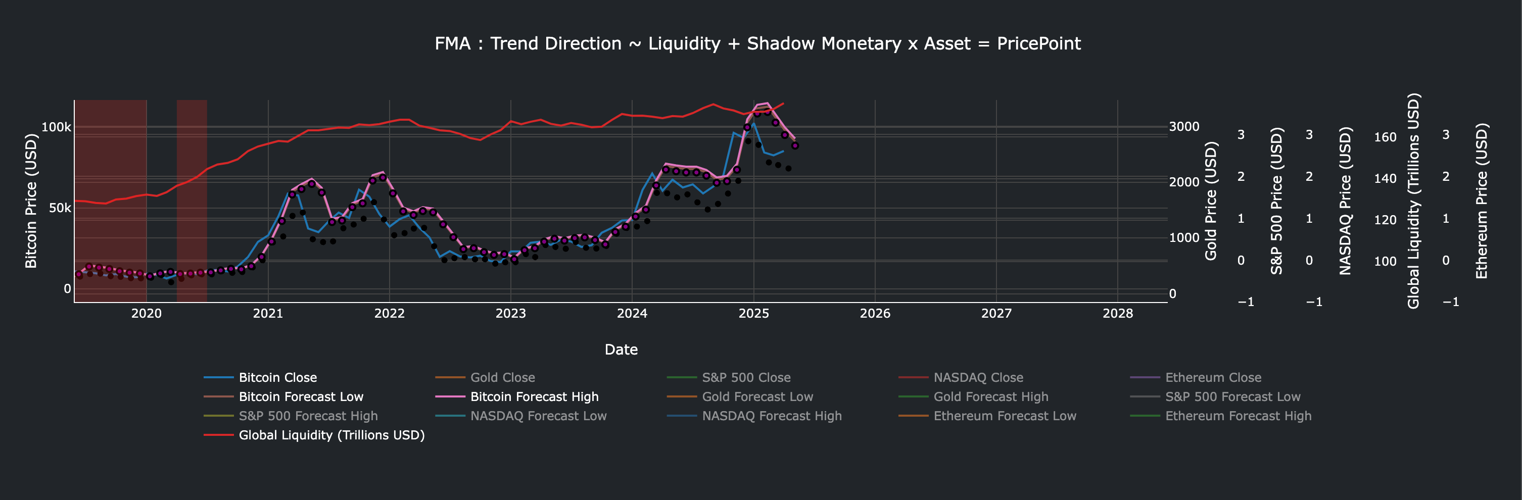
When running against Power Trendline(s) with Percentile Bands, BTC hit the trendline 95%… but BTC has correlation with Gold, and Gold Flowback as both correlate with Global Liquidity, just BTC also correlates with Tech stocks, and Sentiment.
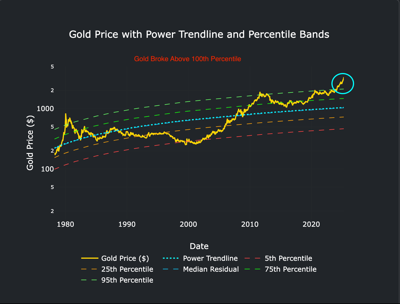
Gold broke above 95 and 100.

Looking at Ratio of Debt/Liquidity (Debt/GDP is irrelevant) for Advanced Economies (Adjusted for Maturity) BTC Possibly has Bottomed as its rolling over, but also means it had a Peak.

BTC correlation with Liquidity to Debt Ratio(s) plotted inverted (Z-Score) we know liquidity needs to increase to roll the maturing debt… so…

BTC v Stress Index, Stress Index looks a lot like its rolling over, therefore BTC should in theory move up… subject to Fed falling in-line with the reality on the liquidity front.

YCC v US Bills issuance coming back into alignment after years of YCC by Yellen / Powell to juice the economy…

Pace of Global Liquidity is rising.
VIX reset likely coordinated to resolve high dollar, force fed to increase liquidity, force yields down to roll some of the debt.

Shadow Monetary Base YoY% Finally broken out.

10s2s YC v Liquidity YoY notice 6m ahead the liquidity isn’t massively jumping up but gradual, to calm the YC, thus the YCC that needs to be unwound.

Global Liquidity Momentum appears to be some coiled spring, its like post inflation era, an attempt was to truly control it unnaturally.

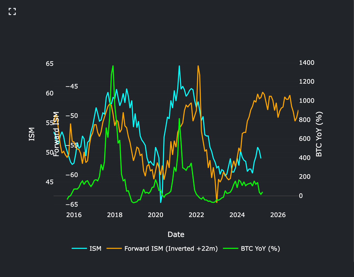
ISM is basically a derivative of Global Liquidity as everything is coordinated to roll the debts, therefore directionally it can be mapped out → Crypto coming back into alignment, what i notice, is though this might have been the peak here, at least in Market-cap, but perhaps not individualistic price(s), though Crypto generally tracks it can be volatile to the upside/downside so that hunch may be proven wrong.

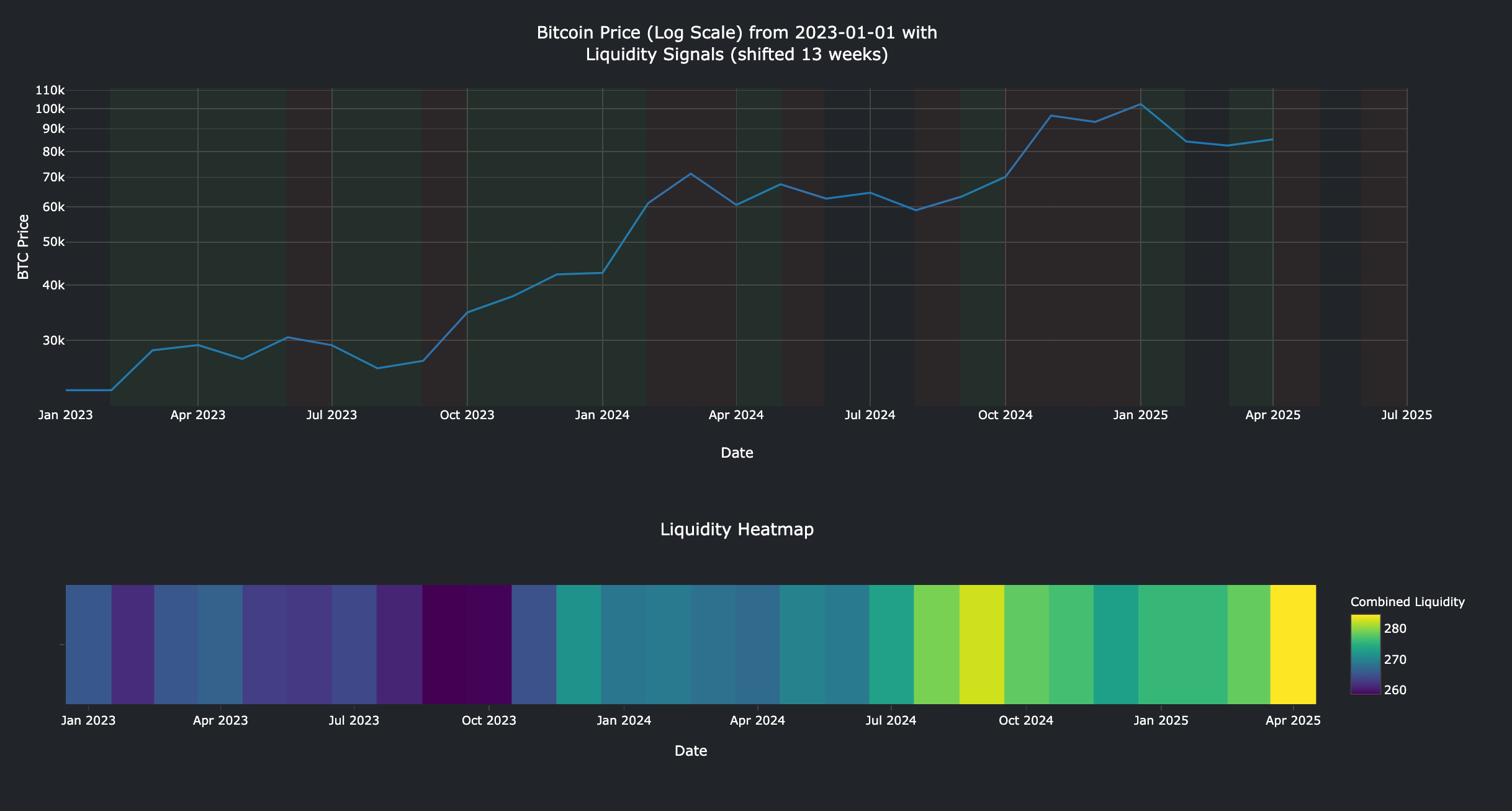
Liquidity leads by 13 Weeks roughly (strong R Score) its rising, therefore BTC should follow.

Though BTC usually tracks Cyclicals v Defensives RoC… and that doesn’t look great..

FCI v BTC → Firmly in a Redzone..

BTC v NFCI → Notice Green usually marks a peak, BTC is in a Green but that Green appears to be declining.. If red shows up or even orange then that would be Risk on for me.
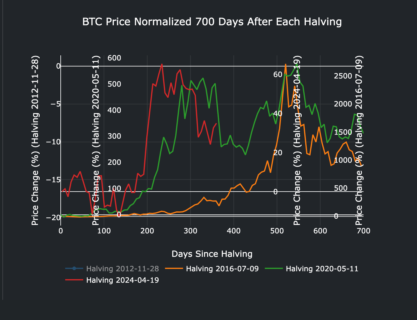
Ref prior Halving’s (if you believe in that) — I firmly believe its a debt refi cycle coupled with debt to liquidity ratio(s) but based on this we’re likely gonna peak if we’ve not already (in BTC) and purely driven by ETF demand.
Yellow marks strong dollar, green marks weak dollar - It’s unlikely this will last till 2026 as some people are saying… dollar likely whipsaws July onwards..

AAA-BBB Spread v BTC - BTC usually tracks… thats likely to increase.
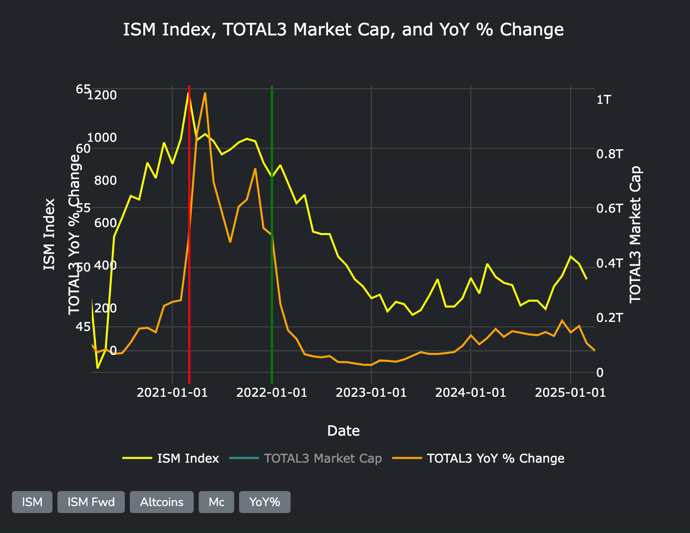
Total3 (Tradingview) YoY v ISM Index… ISM Sucks right now, likely will see 45 as a bottom.
Something i’ve been observing for sometime, usually a marker of bottoms, but unlike prior volatile explosive rises this was a gradual step up as can be seen.
ETH has broken from reality, or ETH is broken as a asset, which doesn’t make sense, around the time of the Bybit hack.
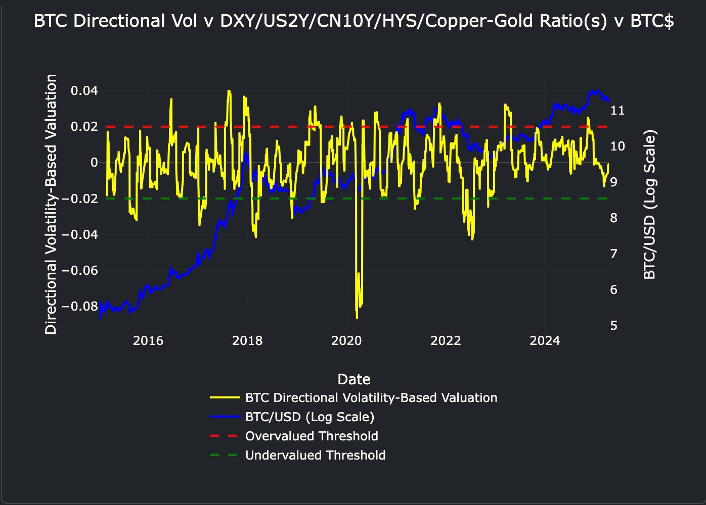
BTC dropdown to its undervalue threshold against volatility-based valuations.

ISM lagging this cycle → BTC normally peaks when the ISM peaks (or around about) either we’re in a long-term recession OR ISM will pick up, ISM follows FCI, which follows Global Liquidity, Global Liquidity is rising FCI is rising, ISM should at some point rise, therefore BTC (and Alts) should in theory rise, BUT BTC was driven by ETF hysteria (in my belief) therefore it may be subdued.

Talking about ISM, a good proxy forward indication is ARKK on Log, directionally at least, if so 45/47… then we will see in a few weeks what way ARKK is going or if that correlation is broken.

Copper-to-Gold Ratio x M2 v BTC paints another indication that ETF’s really did move BTC ahead of time.

BBB Inverted (should have posted alongside AAA-BBB Spread but here we go… when that moves down (up) BTC should move up in $ terms.

FCI Liquidity has moved up, now the way to look at this, is that BTC moving up is moving down % $ wise, meaning in theory BTC has peaked last year, but notice FCI declined around to March then started a roll up again, so in theory down for 3 months up for 1/2 months then dependent on where that goes BTC follows (inversely).

The Above is BTC v YCC v GL Bands, notice BTC (bottomed = peaked) against the GL Fair Band and rejected (declined = rose) → but we know GL has to increase, also notice ETH hitting the Bottom (Top) zone.
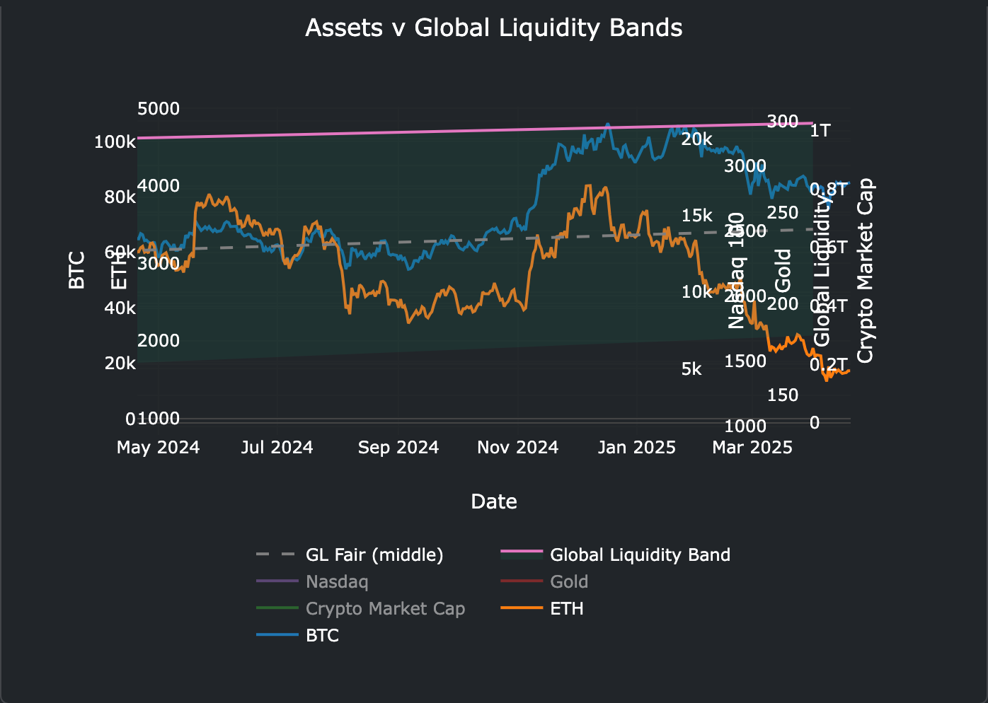
This one is much worse for ETH, ETH literally fallen out of the chart (massively undervalued or Litecoin 2.0?) → notice BTC peaked twice… double touch rejection = Double Tapped, but we know Global Liquidity needs to rise…

Global Liquidity v BTC Linear →13 Week lead, Global Liquidity rising, BTC peaked above rejected, came down, now Liquidity is rising.

Yen Up, Dollar Down = Risk Off…. causes a ruckus in the Yen Carry Trade System, Dollar being crushed by Trump will likely aid but perhaps too late.

ZCIS 1Y Inflation Rate of the Dollar/Yen Carry Trade System, if 1Y Inflation Rate (swap-spread) rises then risk assets have breathing room, for some time, its been sitting above 0 (with a minor drop below) but treading water, never seen it do this for this long.
Forward ISM (22m Lead) provides lots of room for moving up… if that correlation is to remain intact.

BTC Flashing a major buy signal recently (red vertical lines).

Ahead as we can map BTC 13 Weeks ahead based on strong correlation with Global Liquidity (Total Global Liquidity) we see some red=BTC should decline in those periods, mind theres some areas where its black, i.e we have no foresight…
Again signaling that the Trump Tariffs ruined the party at least to July.

BTC v BLFI / P-to-F Oscillator Liquidity Fragility.

It’s some of the first period of major Green…. Yet… Tariffs. (Monthly & Weekly)

One of my faves, that has never failed me directionally forecasting month(s) ahead…
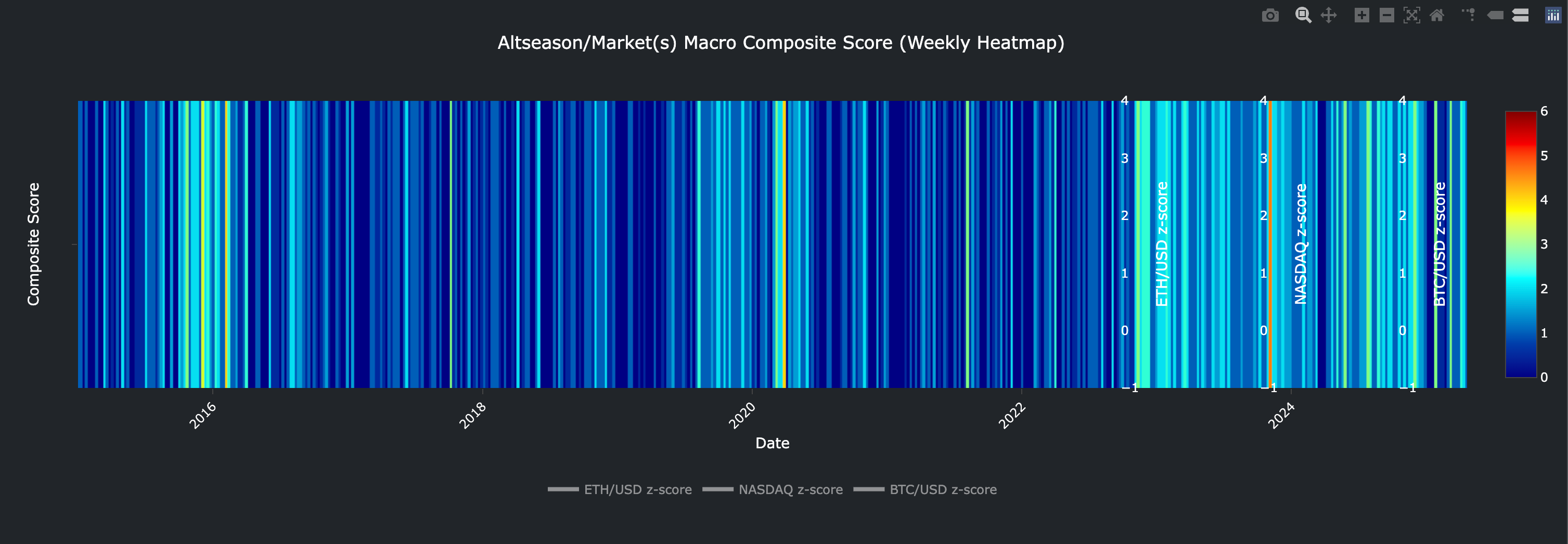
Notice it’s lighting up slowly on the chart (Altcoin macro composite score).
Did Trump steal our lunch money — starting to feel like it — reminds me off all the Crypto Twitter remarks after SBF bought the democratic party and then brought hell down onto Crypto, Trump likewise bought by Crypto money and shat all over macro after pocketing a windfall with his Meme(s), NFT(s) and then Token/Company?
There’s like 2-3,000 dynamic charts in the Catena Terminal, i just follow these one(s) amongst others → highly worth signing up for https://ai.catenacap.xyz